
Rescue 70% of your revenue from the biggest drop-off on checkout page with super-duper tips!
No matter how high or incredible the volume of your website’s traffic is, you still may fall into a zero-revenue scenario if customers dropped-out right in the checkout step.
Research once cited that 69.57% of people that make it to the checkout page never checkout. They get there, and for many reasons happened, they decide to leave without completing any purchase. That’s a huge problem called checkout abandonment.
So, what happened with the conversion funnel? Is there anything in your stores that puts a question on their mind, making them leave the cart never to return? Or is there any information they still need when they’re on the checkout page?
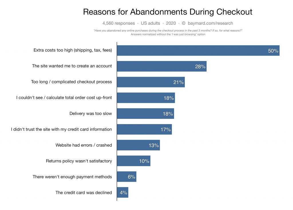
To troubleshoot this hassle, you must address the root cause of checkout abandonment beforehand. These reasons can be easily identified by checking your store’s analytics report or data to point out customer drop-off points, or simply take a quick look at the research below from Baymard:
Source: Baymard
Here they are!
It is shown that people abandoned their checkout steps due to 2 main problems: product-related issues and website-related issues. Have a closer look into web-related issues:
- Registration before checkout (28%)
- Too long checkout process (21%)
- Untrustworthy product/checkout page (17%)
- Unclear return policy (10%)
It’s undeniable that changing the customer’s mind on the checkout page is your last chance to gain revenue.
Hence, optimizing your checkout page is the key to urge customers to complete the sales. To be more specific, the checkout page optimization helps speed up the payment process, remove anything that might distract customers from finishing transactions. By changing some details and elements in your setting, you can eliminate the complexity of your checkout page.
If you want to give customers smooth eCommerce checkout experiences and entice them to complete orders instantly without begging them, read our guidance with 6 crucial tips below that are categorized into 3 key components. Here’s a quick list so you can jump straight to your most urgent issue.
1 – Shorten customer’s purchasing process
#1 Redirect buyers to the checkout page via CTA button
2 – Create a smooth, simple, yet secure checkout flow with no interruption
#2 Keep the Checkout process short with One-page checkout
#3 Show customers the safety checkout page
#4 Show signup option cleverly at the checkout page
3 – Recover abandoned checkout
#5 Add exit-intent popup using SiteKit
#6 Send abandoned cart emails and SMSs to recover checkout rate
Now, let’s dive in!
Menu:
1 – Shorten customer’s purchasing process
Redirect buyers to the checkout page via CTA button
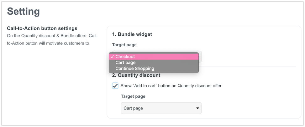
To increase sales on your product detail page and prevent visitors from only browsing and not having any purchase intent at that time, change the Call-To-Action button on your product detail page to redirect buyers directly to the checkout page.
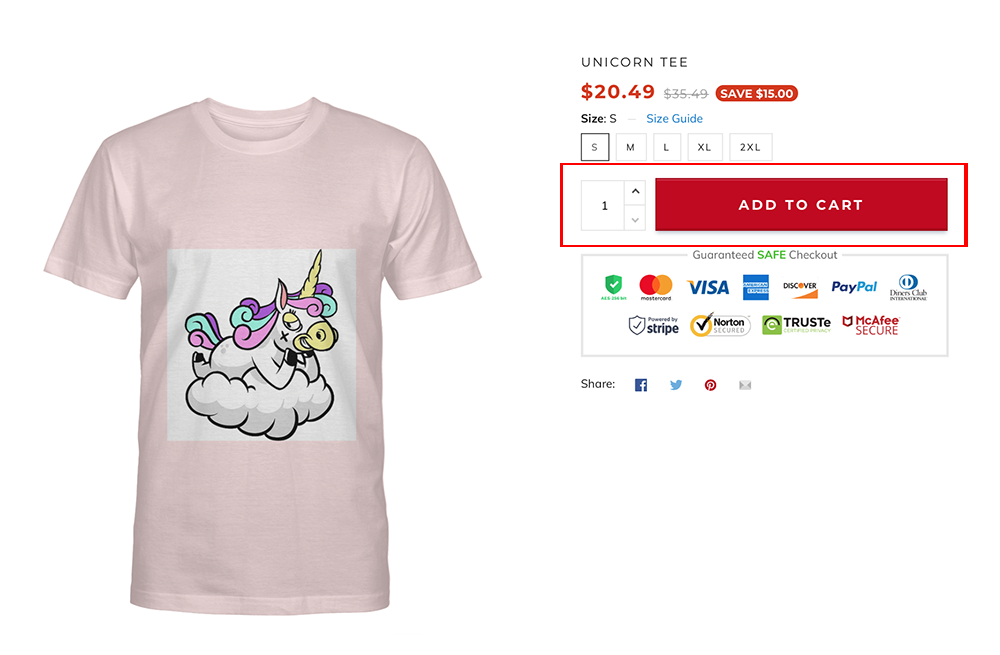
By clicking the optimized “Buy Now” button, consumers can skip the shopping cart page and go directly to the checkout page, which helps shorten their path to complete purchasing products. This is also a great way to motivate customers to buy sooner without giving them too much time to hesitate and consider—such a small but useful tip for driving sales.
2 – Create a smooth, simple, yet secure checkout flow with no interruption
2.1. Keep the Checkout process short with One-page checkout
According to research from Baymard, 21% of US buyers abandoned their carts due to a long or complicated checkout process.
This can be explained by the fact that customers can feel overwhelmed and bothered by long checkout processes. They are likely to leave the purchase journey if there are too many steps to take and various pages to go after completing the first page, which decreases your sales and revenue.
Since multi-page checkout is really time-consuming, keeping things as tight, short, and simple as possible with a one-page checkout is the best way to avoid losing sales and unsatisfied customers.
It has never been easier for your customers to buy items at a glance with ShopBase one page checkout, which displays product selection and checkout forms on a single page. This frees your customers from being overwhelmed by multiple pages and complicated checkout steps.
The right layout and optimized design elements of ShopBase one-page checkout also give customers a smooth checkout experience. They can complete their purchases instantly without leaving the page and are more likely to revisit your store.
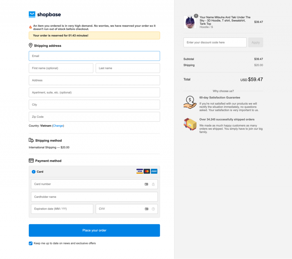
One Page Checkout looks from your ShopBase store.
It is also noted that the checkout process should be in alignment with prior customer experience and habit.
If they are familiar and comfortable with the traditional and popular 3-step-checkout process, you can flexibly switch between one-page checkout and a 3-steps-checkout – which means Addresses, Shipping Methods, and Payment info were separated into 3 different pages.
With a 3-steps-checkout, customers can read and consider more carefully about contact information, shipping, and payment methods before placing orders. Furthermore, they will feel more secure shopping with your store when they can control corresponding filled-in details to every step.
2.2. Show customers the safety checkout page
Baymard Institute found that the percentage of lost sales grew to 17% for credibility and authenticity because customers don’t trust your site with their credit card information.
2.2.1. Display visible trust badges
Since customers are required to fill in their personal and confidential data, even the financial info, it’s best to make sure that your site is trustworthy and reputable.
Hence, it would help if you built your website’s credibility by displaying visible trust badges on Checkout pages to earn customer trust naturally. In a survey, the most trusted security badges are the following: Norton (35.6%), McAfee (22.9%), and TRUSTe (13.2%).
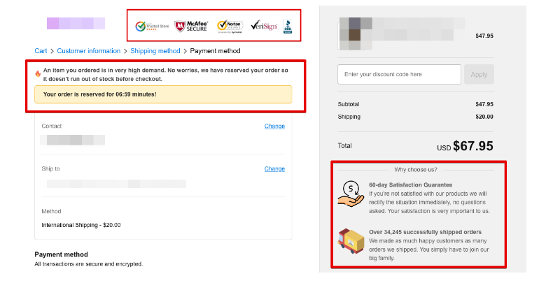
2.2.2. Add a processing countdown timer
Besides that, you can also provide reassurance to customers by adding a processing countdown timer with custom text involved. Thanks to that, customers will know exactly when their orders will be processed or be informed about any shipment delays that prolong the shipping times. Therefore, these tools can powerfully boost your store’s credibility more than you think.
2.2.3. Set policy pages
Clear policies stated on your website will help you avoid any customer confusion and dissatisfaction. It says that your store is transparent with no ambiguous information. By reading your term of services and policies (which is placed right on the checkout page), customers will be able to solve simple problems of the order on their own without bombing your email with a ton of the same questions.
Additionally, your store will avoid many reasonless refunds and chargebacks by setting apparent Refund & Return policies. By doing this, you can limit the customers’ demand for refunds for several primary reasons such as long shipping times or lost interest in your product, etc.
You can set specific policy pages including:
- Refund policy
- Privacy policy
- Terms of Service
- And Shipping policy
By default, these pages will show up at the footer of your checkout page. Check and review your policies carefully before publishing.
2.3. Show sign-up option cleverly at the checkout page
Research from SaleCycle shows that 34% of customers cite that having to create an account is one of the reasons that make them abandon their recent cart.
Whereas getting customers to create an account, leave their email addresses and phone numbers can be beneficial for your online store. It can also lower conversions and even worse – increase cart abandonment rates.
So, it’s super great to allow your new customers to checkout as a guest, which means they can enter the checkout page without having to log-in or sign-up at first. With an option to guest checkout, you can decrease abandoned carts more effectively than you think.
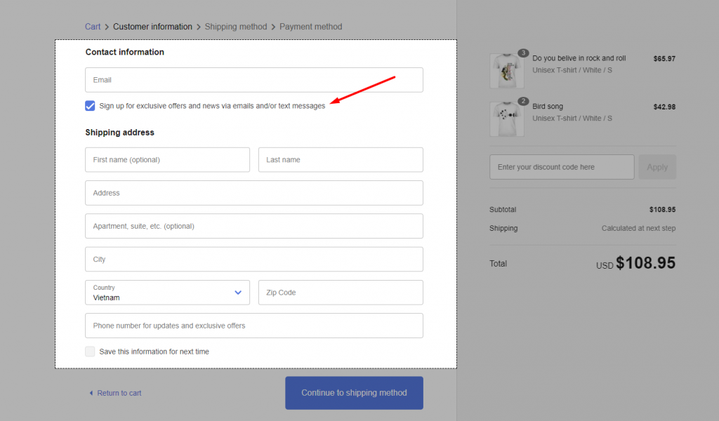
Furthermore, you can cleverly enable the registration option at the checkout page to entice customers to sign up for more newsletters and exclusive offers. Whether they sign up or not, the checkout process still does not harm customers’ purchasing decisions.
3 – Recover abandoned checkout
3.1. Add exit-intent popup using SiteKit
What should we do when customers are about to quit our site without purchasing anything? Even worse, we can’t figure out their drop-off point to stop their leaving intention in time?
This is the time for capturing and converting your visitors with exit-intent technology – one of the most effective ways to prevent them from slipping away, incentivize them to complete their checkout, and continually enjoy shopping.
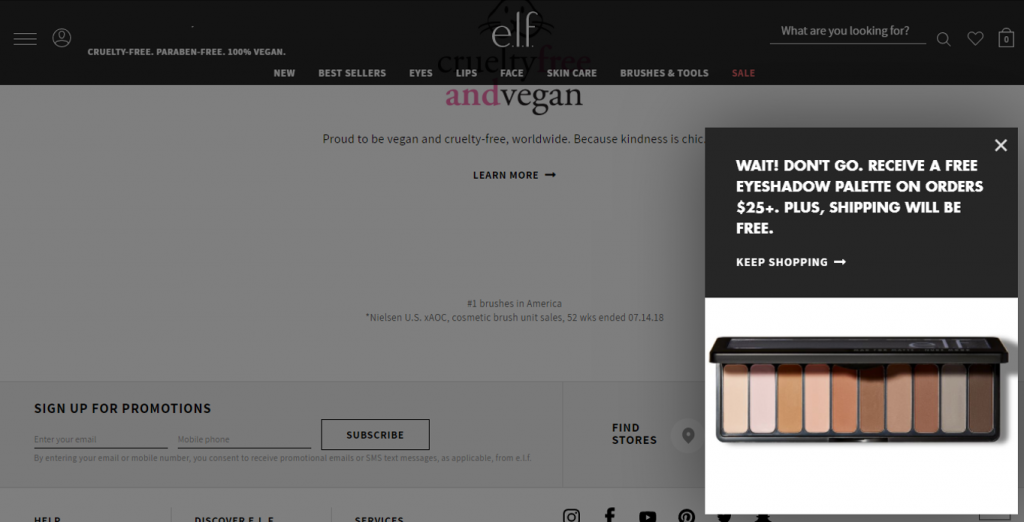
Source: ELF Cosmetics
To save your abandoning visitors, make sure you have an exit-intent technology in place, a powerful feature from ShopBase’s SiteKit. Its mission is to detect the visitors who are about to leave your site without completing a purchase, then presenting them with an irresistible exit-intent offer, like a promo code, a discount, or a gift. After that, it will encourage visitors to continue the purchase before leaving.
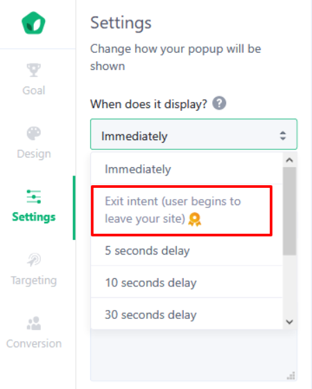
You can choose exactly when the popup appears on your site with SiteKit.
Nobody can resist the attraction from discounts, coupons, and offers, right? So don’t miss this opportunity to gain more sales from your visitors.
>> Craft your dropshipping store with ShopBase today!
3.2. Send abandoned cart emails and SMSs to recover checkout rate
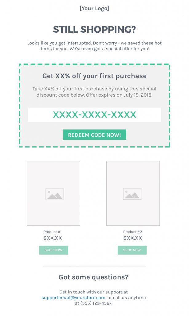
No matter how much traffic your store gets, if your visitors don’t click the Complete Checkout button, you’ll make no sales. Even though all things fail and visitors still abandon their carts, you can also drive them back to your site by using abandoned cart emails and SMSs.
You can conveniently set up an automated email and SMSs to recover abandoned carts using the built-in feature of ShopBase. By sending emails and SMSs to each abandoned checkout on their store, appealing customers with discounts code, you can convert visitors into being a customer, win customers back to the checkout process, and generate more sales from them.
Now it’s your turn!
There is a thing that you should accept that some buyers will abandon their carts no matter how hard you’ve tried to salvage them.
But don’t think of this as an excuse to give up. Instead, try to apply all of the tactics above to bring an impeccable checkout-page to the exceptional purchasing experience. You’ll win some back, and it’s worth doing your utmost.
If you would like to discuss winning more lost sales and how ShopBase can help you to optimize recovery cart abandonment rates, join our community of ShopBase sellers or get more selling tips from the ShopBase blog, we’ll be happy to help!